🔥 Phoenix for All

← Back to main site

Logo Gallery

All concepts in one place. Review, compare, and choose the direction that feels right.

🌟 Ground to Stars — New Concepts
Ground to Stars v1
Concept 07
Ground to Stars — Full Story
Phoenix rising from earth community dots toward a satellite above. Gold ground communities → Green/Blue phoenix → Blue stars. Pink heartbeat glow at the core.
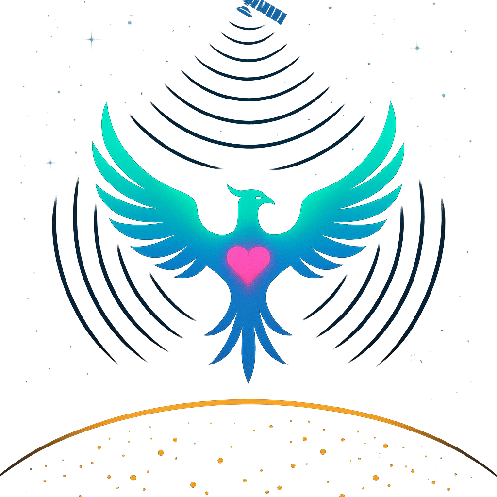
GreenBlueGoldPink accent
Ground to Stars v2
Concept 08
Earth / Phoenix / Stars
Three-zone vertical composition. Earth with gold community lights below. Phoenix bridging the gap in the middle. Starlink satellite and stars above. Signal arcs radiating outward.
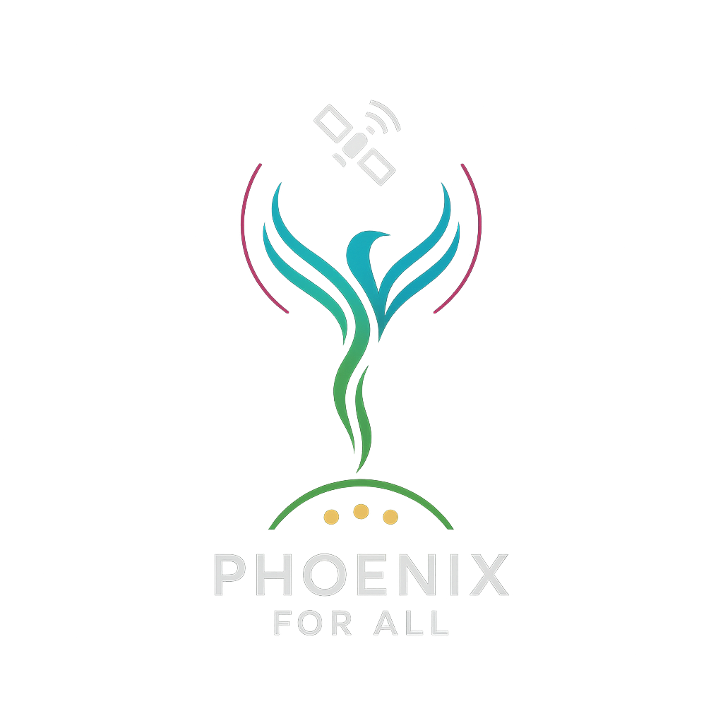
GreenBlueGoldPink heartbeat
Ground to Stars v3
Concept 09
Minimal Signal Path
Ultra-clean. Earth arc at bottom → phoenix rising → satellite at top. Pink accent lines trace the signal path like a pulse or heartbeat. Works at any size — favicon to billboard.
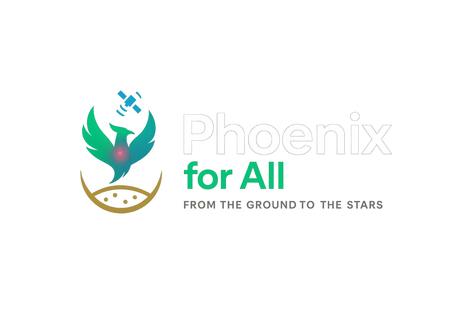
GreenBluePink trace
Wordmark Ground to Stars
Concept 10
Full Wordmark — "From the ground to the stars."
Complete brand identity. Mark on left, "Phoenix for All" text on right with tagline. Ready for letterhead, website header, grant applications, and press kits.
GreenBlueGoldPink accent
Where Fire Ends
Concept 11 ⭐ FAVOURITE
Where The Fire Ends, The Stars Begin
Phoenix at the exact threshold — ash/fire below, stars/space above. The most visual expression of the mission. Pure soul.
GreenBlueGoldPink
Final Wordmark
Concept 12
Full Wordmark — "From Ash to Stars"
Concept 11 with "Phoenix for All" and "From Ash to Stars" integrated. Billboard / grant proposal ready.
Full BrandWith Tagline
Badge Lockup
Concept 13
Circular Badge / Seal
"Phoenix for All" arced above, "From Ash to Stars" arced below. Social profile, wax seal, document header.
CircularSeal
Earlier Concepts
Logo Mark v1
Concept 01
Original Mark — Transformation
Stylized phoenix with rough-to-smooth line transition. Represents matter changing form — waste becoming energy becoming signal.
GreenBlue
Phoenix above Earth
Concept 02
Phoenix Above Earth
Phoenix rising above the Earth with community dots below. The bird and the planet together — early version of the ground-to-stars concept.
GreenBlue
Full Wordmark
Concept 03
Original Full Wordmark
Icon + text lockup. First complete brand identity attempt. Good structure, earlier color palette.
GreenBlue
Tricolor Phoenix
Concept 04
Tricolor Phoenix + WiFi Signal
Three energy streams — green, blue, pink — weaving into the phoenix form. Wings become WiFi arcs below. Strong energy, bold colors.
GreenBluePink
Green Blue Gold
Concept 05
Green + Blue + Gold — No Pink
Phoenix formed from three feather streams in green, blue, and gold. Tail becomes gold WiFi arcs. Clean and warm — no pink. Serious NGO energy.
GreenBlueGold
Minimal Mark
Concept 06
Minimal Mark — Favicon Ready
V-shape phoenix rising, green-to-blue gradient, gold WiFi arcs below. Works at 16px as a favicon or blown up to billboard scale. Extremely versatile.
GreenBlueGold